Adding a Little Byte of Transparency
I’m considering adding a little bit of transparency to how, and perhaps how well, Kolab Now infrastructure is run, or is running.
You may think that’s a status board — but it isn’t. I’m considering something like a status board, but I need it completely external to the production infrastructure and being reported to — rather than it obtaining way too much access to all sorts of systems — without requiring manual intervention to update. Manual intervention to updating anything is what we use @kolabops on Twitter for.
Furthermore, I have some sort of representation on the current stability and predicted future stability provided changes that are going to need to be applied to the environment at some point sooner or later. I’m not just thinking in terms of performance (this here thing may be slow right now), but OS, product and service updates — that inherently introduce a level of risk in their application.
The trick is going to be to define how these statistics would correlate to the overall “health” situation. The trick is in representing the overall “score” in such unambiguous fashion, that it does not raise more questions than they answer. On the other hand, why start with such ambitions and not just see how well the raw data sits with our audience?
So, I’m thinking to start disclosing such rather ambiguous data, probably in some ill-formed fashion originating directly from our own monitoring and trending systems.
Take the following graph, and then let’s dive right in to learn to appreciate what it might actually mean;
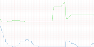 The missing X axis definition is just time. The missing Y axis definition is “average number of changes across all systems”. The green line represents changes pending application. The blue line represents changes actually applied.
Even though changes pending may not be applicable to services directly, I would propose to you that changes pending establish a representation for the level of stability to be anticipated for the near future — changes applied are never without risk.
Therefore, I would propose that changes applied (the blue line) have executed on a risk.
We have several hundreds such graphs ranging from disk latency to context switches and web client action response times. Logically, all of them are relevant to some significant or lesser extent. Interpreting what each of the metrics mean in conjunction to all other metrics, so that we can improve performance and address potential future bottle-necks ahead of time is, frankly, a day-job.