Menus, cockpits and logins…
In September we moved to a new and smarter user account administration tool. Just navigate back a few entries in the blog to read about that event.
This new tool was built with new technology and more modern models, and the team was rethinking the architecture from the ground up. The new module, which has taken a more central position in Kolab, makes it easier to make changes and improve the feature sets. It has put us in a position to move forward faster and more effective than ever before. The cockpit (also sometimes referred to as the dashboard) will become the central hub for a variety of new features that we’ll add over time.
This is of course no news. As mentioned above, we have been babbling about that for a while on this blog. The news in this post is that we have made a change. Based on feedback from User Experience specialists and (mostly) You, our customer, we have made a change to the menus in our systems. Let’s take a look at the changes:
You will see that the front page has changed. We have tried to follow your feedback, and have made price examples available on the front page.
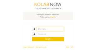
The login button in the upper right corner of the front page is still taking you to the login page for the webclient. This has not changed. From here you can follow the link under the login prompt: Manage account to the cockpit login.
We are aware that this is not optimal, and the next update will bring the elements into the right place. The Login button will then take you directly to the cockpit, which will be the new center of your Kolab Now account.
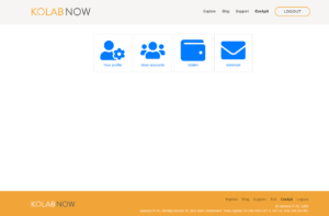
This looks familiar? In the cockpit you will find access to your different features; Profile, User accounts, Wallet and Webmail. As we go forward and develop new features (like the audio/video conference tool that we are currently working on) you will also find the access to those features here.
Moving the access to the cockpit does not seem to be a big change, but it does break with our previous “type in the URL” approach. Rather than being the primary feature, the webclient has been moved to become one among a growing number of features.
When we deployed the new cockpit module back in September, we made the Kolab Now logo in the upper left corner of the screen link back to the cockpit. Users told us, that this was confusing, so we have changed that. The logo now links to the web front page, as is an unwritten but often used standard for webpages. A menu point in the upper right block menu is now pointing to the cockpit. We hope that this can reduce the confusion.
We thank you for giving us the feedback that helped us improve the service for you, and we hope that the changes we pushed made you like your Kolab Now even more. Where as Support is always available to service your issues and take your feedback, also be aware of our knowledge base.


