A New Gregorian Year, A New Responsive Skin
The change of the year is always a good opportunity to look back at what has happened, and to make changes for the future. Earlier we have been writing about the work put into the Responsive skin (elastic skin) and it’s now time to enjoy the result we got out of the work that was done.
A version of a responsive skin was available on beta.kolabnow.com/apps for a while, but now it has finally passed QA, and is made available for all Kolab Now users.
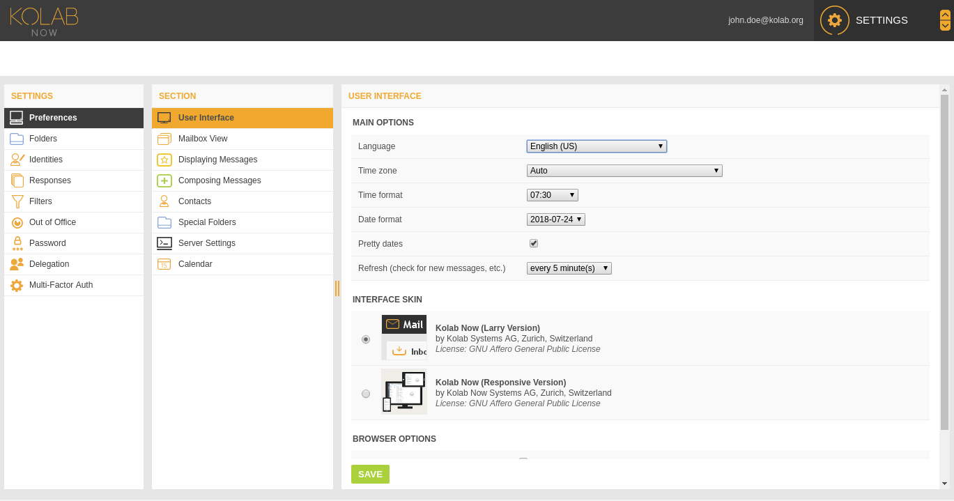
To enable the new Responsive skin:
Go to Settings -> Preferences -> User Interface
Under Interface Skin, select Kolab Now (Responsive Version) instead of Kolab Now (Larry Version)
 |
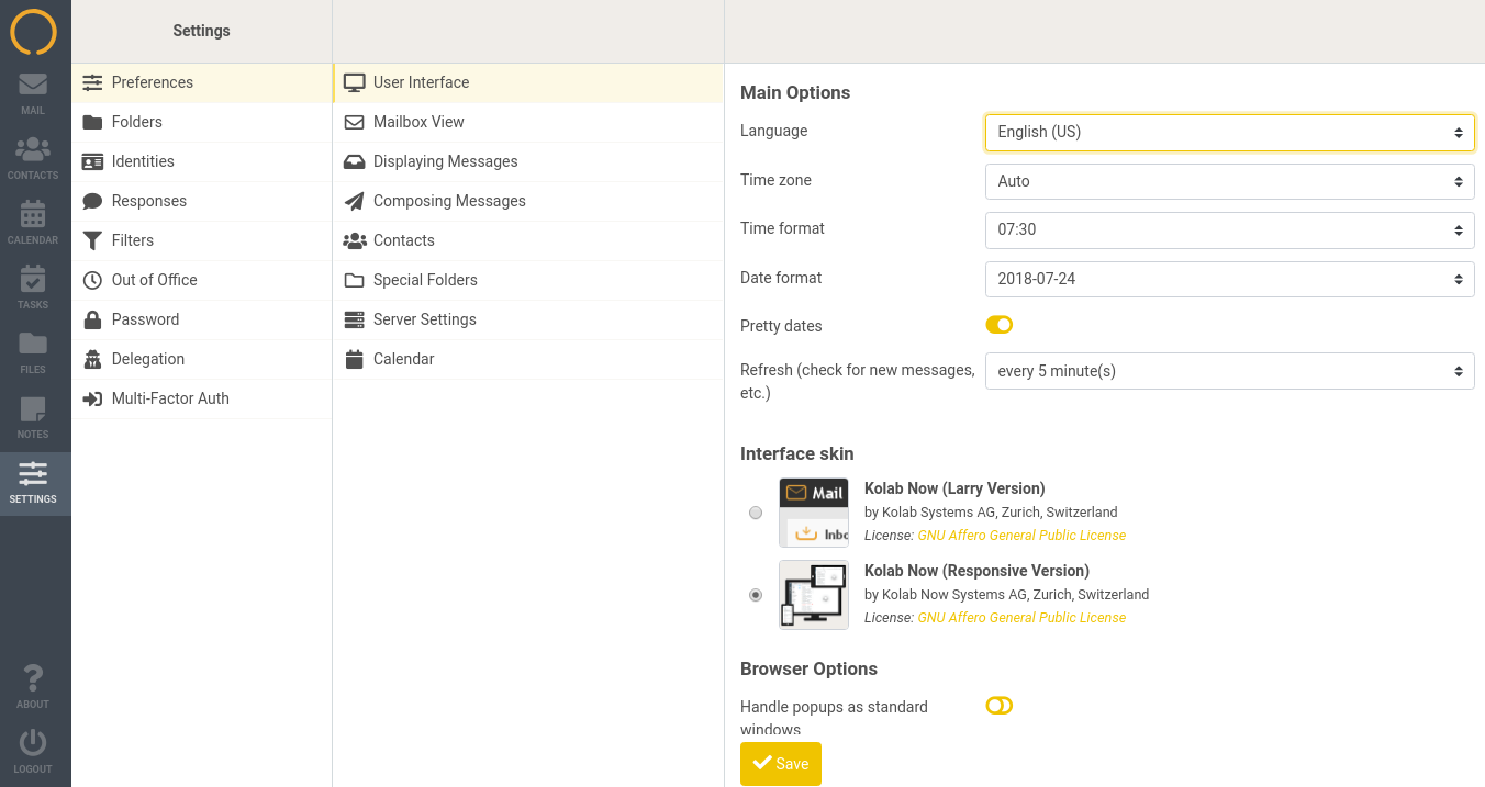 |
As described in the previous post about the Responsive skin, the skin is making the web client useful on mobile devices; pads and mobilephones. It is (as the name indicates) responding to the amount of space available on the display, and present the most important information in a easy to use fashion.
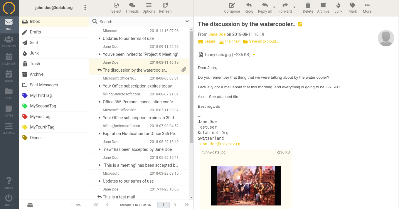 |
On a Full Desktop there is obviously more space available… |
| …than there is on a tablet type device. On a mobile phone, the left-hand application bar is folded in to the top bar. | 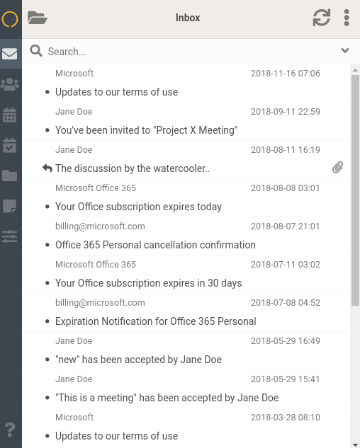 |
This is quite a significant change, and therefore we have not changed the defaults. You would need to choose to use the responsive skin. We appreciate your feedback before we switch defaults, and as always, contact support@kolabnow.com with your questions, comments and remarks.